All You Need To Know About Product Management

The purpose of this pattern library is to serve as a reference for how commonly used components should be marked up and styled. Mark On Product is written using Markdown. Most core components are written using GitHub Flavored Markdown. Many of the common patterns are detailed below, this cheatsheet is also helpful. The GitHub Markdown documentation also serves as a great reference.
Mark On Product is built using Jekyll, the theme is built from Lanyon and has been heavily customized.
Colors
There are several core “brand” colors, two primary colors and one secondary color.
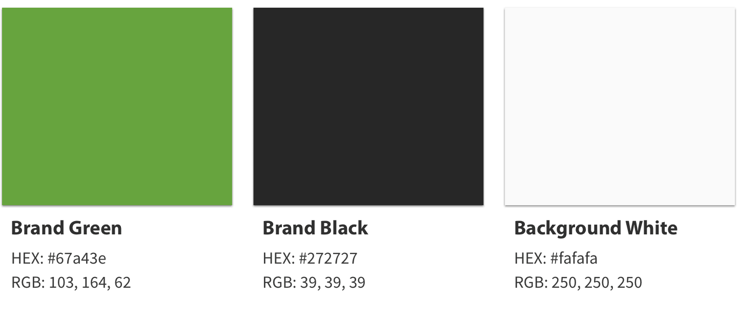
.brand-green {color: #67a43e}
.brand-black {color: #272727}
.background-white {color: #fafafa}
Typography
The fonts choices are intentionally limited and each has a specific purpose. Post Titles h1 are set in Myriad Pro. Post Subpage Titles h2, Section Headers h3, and Subsection Headers h4 are all set in PT Sans.
Headings
Post Titles (h1)
# Post Title (h1)
font-family: Myriad Pro
Subpage Title (h2)
## Subpage Title (h2)
font-family: PT Sans
Section Header (h3)
### Section Header (h3)
font-family: PT Sans
Subsection Header (h4)
#### Subsection Header (h4)
font-family: PT Sans
Paragraph
Lorem ipsum dolor sit amet, consectetur adipiscing elit. Proin aliquet sed magna et sodales. Vestibulum vehicula dolor sit amet luctus viverra. Praesent facilisis dictum sapien, et elementum lorem imperdiet pulvinar. Nulla lacinia, arcu eget venenatis dapibus, neque tellus vestibulum elit, tempor condimentum turpis elit a justo.
{font-family: "source-sans-pro";
color: #393939;
font-size: 22px;
font-weight: 300;
line-height: 35.2px;}
Paragraph Lead Text
Lorem ipsum dolor sit amet, consectetur adipiscing elit. Proin aliquet sed magna et sodales. Vestibulum vehicula dolor sit amet luctus viverra. Praesent facilisis dictum sapien, et elementum lorem imperdiet pulvinar.
<span class="lead">Lead Text</span>
Italics
Italics can be used for emphasis.
*Italics*
Bold
Bold text can be used for stronger emphasis.
**Bold text**
Abbreviations
Abbreviations, like AWOL should use <abbr>, with an optional title attribute for the full phrase.
<abbr title="absent without leave">AWOL</abbr>
Citations
Citations, like — Mark Mitchell, should use <cite>.
<cite>— Mark Mitchell</cite>
Deleted Text
Deleted text should use <del>.
<del>Deleted</del>
Inserted Text
Inserted text should use <ins>.
<ins>Inserted</ins>
Superscript Text
Superscript text uses <sup>.
Superscript <sup>text</sup>
Subscript Text
Subscript text uses <sub>.
Subscript <sub>text</sub>
Code Stlyes
Code markup is automatically applied by the Markdown parser as long as the correct code type is added. Styles are handled by Pygments via the syntax.css stylesheet.
Inline
Inline code has (back-ticks) around it.
`code`
Markdown
### H3 Example
CSS
.brand-green {color: #67a43e}
HTML
<h2 class="brand-green">Post Subtitle</h2>
Lists
There are four lists styles supported. Unordered lists, ordered lists, mixed lists, and definition lists. All lists can be written in Markdown except for definition lists, they are written in HTML.
Unordered Lists
- Praesent commodo cursus magna, vel scelerisque consectetur et.
- Donec id elit non mi porta gravida at eget metus.
- Nulla vitae elit libero, a pharetra augue.
* Praesent commodo cursus magna, vel scelerisque consectetur et.
* Donec id elit non mi porta gravida at eget metus.
* Nulla vitae elit libero, a pharetra augue.
Ordered Lists
- Praesent commodo cursus magna, vel scelerisque consectetur et.
- Donec id elit non mi porta gravida at eget metus.
- Nulla vitae elit libero, a pharetra augue.
1. Praesent commodo cursus magna, vel scelerisque consectetur et.
2. Donec id elit non mi porta gravida at eget metus.
3. Nulla vitae elit libero, a pharetra augue.
Mixed Lists
- Praesent commodo cursus magna, vel scelerisque consectetur et.
- Mixed Item One
- Mixed Item Two
- Donec id elit non mi porta gravida at eget metus.
1. Praesent commodo cursus magna, vel scelerisque consectetur et.
   * Mixed Item One
   * Mixed Item Two
2. Donec id elit non mi porta gravida at eget metus.
Definition Lists
- Aluminum
- Aluminium or aluminum is a chemical element with symbol Al and atomic number 13. It is a silvery-white, soft, nonmagnetic and ductile metal in the boron group.
- Brass
- Brass is a metallic alloy that is made of copper and zinc. The proportions of zinc and copper can vary to create different types of brass alloys with varying mechanical and electrical properties.
- Copper
- Copper is a chemical element with symbol Cu (from Latin: cuprum) and atomic number 29. It is a soft, malleable, and ductile metal with very high thermal and electrical conductivity.
<dl>
  <dt>Aluminum</dt>
  <dd>Aluminium or aluminum is a chemical element with symbol Al and atomic number 13. It is a silvery-white, soft, nonmagnetic and ductile metal in the boron group.</dd>

  <dt>Brass</dt>
  <dd>Brass is a metallic alloy that is made of copper and zinc. The proportions of zinc and copper can vary to create different types of brass alloys with varying mechanical and electrical properties.</dd>

  <dt>Copper</dt>
  <dd>Copper is a chemical element with symbol Cu (from Latin: cuprum) and atomic number 29. It is a soft, malleable, and ductile metal with very high thermal and electrical conductivity.</dd>
</dl>
Tables
Tables used are fairly simple, nothing too tricky.
Standard Left Aligned
| Company | Contact | Country |
|---|---|---|
| Alfreds Futterkiste | Maria Anders | Germany |
| Centro Moctezuma | Francisco Chang | Mexico |
| Ernst Handel | Roland Mendel | Austria |
| Island Trading | Helen Bennett | UK |
| Company | Contact | Country |
| --- | --- | --- |
| Alfreds Futterkiste | Maria Anders | Germany |
| Centro Moctezuma | Francisco Chang | Mexico |
| Ernst Handel | Roland Mendel | Austria |
| Island Trading | Helen Bennett | UK |
Mixed Alignment
| Company | Contact | Country |
|---|---|---|
| Left Aligned | Center Aligned | Right Aligned |
| Centro Moctezuma | Francisco Chang | Mexico |
| Ernst Handel | Roland Mendel | Austria |
| Island Trading | Helen Bennett | UK |
| Company | Contact | Country |
| --- | :---: | ---: |
| Left Aligned | Center Aligned | Right Aligned |
| Centro Moctezuma | Francisco Chang | Mexico |
| Ernst Handel | Roland Mendel | Austria |
| Island Trading | Helen Bennett | UK |
Links
Links will look like this, nice and simple.
[Linked Text](http://url.com)
Image Sizing and Formatting
Images can be sized using this Sketch template. There’s no secret to the sizing, but it will ensure consistency. There’s four sizes, you should consider the final display size as a percentage of the full-body width i.e., 25% of the content container.
The width is set by adding a class .width-25, .width-50, .width-75 or .width-100. Images are 100% wide by default so adding a width class isn’t necessary. On small (mobile sized) screens all images are 100% wide by default.
All image filetypes are acceptable, but care should be taken to ensure the appropriate types are being used. .jpg should be used for photos and .png should be used for design assets (like logos).
Cloudinary will serve the smallest filetype and size automatically as long as the .cld-responsive class is added.
25% Width

{: .cld-responsive .width-25}
50% Width

{: .cld-responsive .width-50}
75% Width

{: .cld-responsive .width-75}
100% Width

{: .cld-responsive .width-100}
Note: 100% width is default so adding this class won't be needed in most cases.
25% Width (Float Left)
Lorem ipsum dolor sit amet, consectetur adipiscing elit. Proin aliquet sed magna et sodales. Vestibulum vehicula dolor sit amet luctus viverra. Praesent facilisis dictum sapien, et elementum lorem imperdiet pulvinar. Nulla lacinia, arcu eget venenatis dapibus, neque tellus vestibulum elit, tempor condimentum turpis elit a justo.
{: .cld-responsive .width-25 .float-left}
25% Width (Float Right)
Lorem ipsum dolor sit amet, consectetur adipiscing elit. Proin aliquet sed magna et sodales. Vestibulum vehicula dolor sit amet luctus viverra. Praesent facilisis dictum sapien, et elementum lorem imperdiet pulvinar. Nulla lacinia, arcu eget venenatis dapibus, neque tellus vestibulum elit, tempor condimentum turpis elit a justo.
{: .cld-responsive .width-25 .float-right}
50% Width (Float Left)
Lorem ipsum dolor sit amet, consectetur adipiscing elit. Proin aliquet sed magna et sodales. Vestibulum vehicula dolor sit amet luctus viverra. Praesent facilisis dictum sapien, et elementum lorem imperdiet pulvinar. Nulla lacinia, arcu eget venenatis dapibus, neque tellus vestibulum elit, tempor condimentum turpis elit a justo.
{: .cld-responsive .width-50 .float-left}
75% Width (Float Left)
Lorem ipsum dolor sit amet, consectetur adipiscing elit. Proin aliquet sed magna et sodales. Vestibulum vehicula dolor sit amet luctus viverra. Praesent facilisis dictum sapien, et elementum lorem imperdiet pulvinar. Nulla lacinia, arcu eget venenatis dapibus, neque tellus vestibulum elit, tempor condimentum turpis elit a justo.
{: .cld-responsive .width-75 .float-left}
Linked Image
[{: .cld-responsive}](http://www.example.com/ "Example Title")
Cloudinary URLs
Cloudinary is used for all image and asset hosting. Use the code below to automatically build the URLs and add the .cld-responsive class.
{: .cld-responsive}
Horizontal Rules and Dividers
In most cases dividing lines will be added by default as part of the design. In scenarios where you’d like to add a divider manually, there’s two ways to do it.
The first is to add class .divider. This should be used to add a divider to an HTML element.
h3 With a Divider
Image With a Divider
### h3 With a Divider
{: .divider}
In circumstances when there isn’t an element to add the divider class to, simply generate a <hr> using Markdown.
---
Message Styles
Messages can be used to call special attention to important content. Messages should not be longer than one or two short sentences.
To create a message, add .message to a paragraph. This defines the default style. To create a secondary, success, alert, or danger message add that as a second class. This concept is loosely based on how Bootstrap styles alerts.
Default Message
{: .message}
Secondary Message
{: .message .message-secondary}
Success Message
{: .message .message-success}
Alert Message
{: .message .message-alert}
Danger Message
{: .message .message-danger}
Blockquotes
“This is quoted text”
> "This is quoted text"